Introduction
The Cook County property tax system spans hundreds of municipalities, school districts, townships, TIFs, and other taxing districts. When performing analysis, it can sometimes be difficult to remember that each district is a place, made up of many individual properties all paying taxes to fund the district’s services. Mapping can help relate your analysis to a place and its properties. It can also reveal otherwise hidden spatial patterns.
The PTAXSIM database includes the data necessary to create maps and
perform spatial analysis. Specifically, it includes the boundary and
centroid of each parcel, for each year, starting in 2006. This data is
exposed via the pin_geometry SQL view and can also be
queried in R using the lookup_pin_geometry() function.
The rest of this vignette walks through the process of using PTAXSIM
to create maps. This vignette assumes familiarity with R’s sf package
ecosystem and ggplot2.
Making single-area maps
We’ll start by making simple maps of single taxing districts and areas. These are useful for showing local spatial patterns such as the distribution of property classes, assessed values, or tax bill amounts.
To start, load some useful libraries and instantiate a PTAXSIM
database connection with the default name (ptaxsim_db_conn)
expected by PTAXSIM functions.
library(DBI)
library(data.table)
library(dplyr)
library(ggplot2)
library(ggspatial)
library(glue)
library(here)
library(ptaxsim)
library(sf)
library(stringr)
library(tidyr)

ptaxsim_db_conn <- DBI::dbConnect(RSQLite::SQLite(), here("./ptaxsim.db"))
Single taxing district
We’re going to use the the Village of Ford Heights as our example taxing district, since it’s relatively small and uncomplicated.
To create a map of Ford Heights, we first need to determine which properties are within its boundaries. Fortunately, PTAXSIM’s database has all the data required to accomplish this task. In fact, you can extract the PINs of any taxing district using only attribute (non-spatial) joins.
This is because the tax system is roughly hierarchical: taxing districts (agencies) are made up of tax codes, and tax codes are made up of PINs (properties). As a result, as long as we have a district’s agency number, we can find its tax codes and then its PINs. The agency number is the ID used by the Clerk to track different taxing bodies.
Gathering PINs of interest
To find the agency number of Ford Heights, we can directly
query PTAXSIM’s database and look in the agency_info
table:
fh_agency_nums <- DBI::dbGetQuery(
  ptaxsim_db_conn,
  "SELECT agency_num, agency_name, minor_type
  FROM agency_info
  WHERE agency_name LIKE '%FORD HEIGHTS%'"
)

fh_agency_nums
#>   agency_num                                 agency_name minor_type
#> 1  030410000                     VILLAGE OF FORD HEIGHTS       MUNI
#> 2  030410500 TIF - FORD HEIGHTS - COTTAGE GROVE / RTE 20        TIF
#> 3  050345000                  FORD HEIGHTS PARK DISTRICT       PARK
#> 4  060140000        FORD HEIGHTS PUBLIC LIBRARY DISTRICT    LIBRARY
Here we can see the various taxing bodies that make up Ford Heights,
as well as their types. The agency number we want is
030410000 for the VILLAGE OF FORD HEIGHTS.
With the agency number, we can find all of the tax codes that make up
the municipality. To do so, we can again query PTAXSIM directly, this
time looking in the tax_code table:
fh_tax_codes <- DBI::dbGetQuery(
  ptaxsim_db_conn, "
  SELECT tax_code_num
  FROM tax_code
  WHERE agency_num = '030410000'
  AND year = 2021
  "
)
Finally, we can find all Ford Heights PINs with one last direct
query. This time we’ll look in the pin table using the tax
codes retrieved before. We’ll use the glue library for
string expansion to make things a bit easier:
fh_pins <- DBI::dbGetQuery(
  ptaxsim_db_conn,
  glue_sql("
    SELECT pin, class
    FROM pin
    WHERE tax_code_num IN ({fh_tax_codes$tax_code_num*})
    AND year = 2021
    ",
    .con = ptaxsim_db_conn
  )
)

glimpse(fh_pins)
#> Rows: 1,959
#> Columns: 2
#> $ pin   <chr> "32133000010000", "32133000020000", "32133000040000", "321330000…
#> $ class <chr> "239", "239", "239", "203", "100", "224", "593", "239", "590", "…
So, in tax year 2021, the Village of Ford Heights has about 2,000 individual PINs.
Mapping the area
Now that we have all the Ford Heights PINs, we can use them to make a
simple parcel map of the area. First, we’ll get the PIN boundaries.
These can be retrieved using lookup_pin10_geometry().
However, note that lookup_pin10_geometry() expects
10-digit PINs, while the PINs we’ve seen so far are 14 digits. This is
because the last 4 digits of each PIN typically represent the
unit number within a single building (usually a condominium
building). Individual units do not have their own parcel shape; they all
share the same 10-digit parcel. Conversely, most residential units do
not have more than one tax paying unit, so their last 4 digits are
almost always 0000.
So, we’ll need to pass 10-digit PINs to
lookup_pin10_geometry() in order to retrieve parcel shapes.
We can do that by simply truncating the 14-digit PINs and keeping only
the unique results.
fh_pin10s <- unique(substr(fh_pins$pin, 1, 10))
fh_pins_geo <- lookup_pin10_geometry(year = 2021, pin10 = fh_pin10s)
The geometry column returned by
lookup_pin_geometry() is initially just a character vector
stored in the WKT
format. In order to make it useful in R, we need to convert it to an
actual geometry object. We can do that using the st_as_sf()
function from sf. Note that we need to manually specify the
CRS
of the data, which in this case is 4326 AKA lat/lon.
Now we need some attribute to visualize besides just the parcel boundaries themselves. Each property’s class is included in the PTAXSIM database, but class only applies at the 14-digit PIN level. To make our map, we can collapse class to the 10-digit PIN level by taking an arbitrary class for each PIN10. We can also bucket the classes into larger groups to clean things up a bit.
fh_pins_geo <- fh_pins_geo %>%
  left_join(
    fh_pins %>%
      mutate(pin10 = substr(pin, 1, 10)) %>%
      group_by(pin10) %>%
      summarize(class = first(class)),
    by = "pin10"
  ) %>%
  mutate(
    major_class = substr(class, 1, 1),
    major_class_fct = recode_factor(
      major_class,
      "0" = "0 & 1 - Vacant and Exempt",
      "1" = "0 & 1 - Vacant and Exempt",
      "2" = "2 - Residential",
      "3" = "3 & 5 - Commercial",
      "5" = "3 & 5 - Commercial",
      "6" = "6, 7, 8 - Incentive",
      "7" = "6, 7, 8 - Incentive",
      "8" = "6, 7, 8 - Incentive"
    )
  )
For extra flavor, we can get the municipality boundary for Ford Heights from Cook Central, the County GIS data portal.
bound_muni <- st_read(paste0(
  "https://opendata.arcgis.com/api/v3/datasets/",
  "534226c6b1034985aca1e14a2eb234af_2/downloads/",
  "data?format=geojson&spatialRefId=4326&where=1%3D1"
), quiet = TRUE) %>%
  filter(MUNICIPALITY == "Ford Heights")
Finally, we can plot the PINs and municipality boundary on a single map.
Click here to show plot code
fh_pins_map <- ggplot() +
  annotation_map_tile(type = "cartolight", zoomin = -1) +
  geom_sf(
    data = fh_pins_geo,
    aes(fill = major_class_fct),
    alpha = 0.5,
    linewidth = 0.1
  ) +
  geom_sf(data = bound_muni, fill = "transparent", linewidth = 1) +
  annotation_scale(location = "br") +
  scale_fill_manual(
    name = "",
    values = c(
      "0 & 1 - Vacant and Exempt" = "#984ea3",
      "2 - Residential" = "#e41a1c",
      "3 & 5 - Commercial" = "#377eb8",
      "6, 7, 8 - Incentive" = "#4daf4a"
    )
  ) +
  guides(color = guide_legend(override.aes = list(size = 5))) +
  theme_void() +
  theme(
    legend.title = element_text(size = 14),
    legend.text = element_text(size = 10),
    legend.key.size = unit(18, "points"),
    legend.position = "bottom"
  )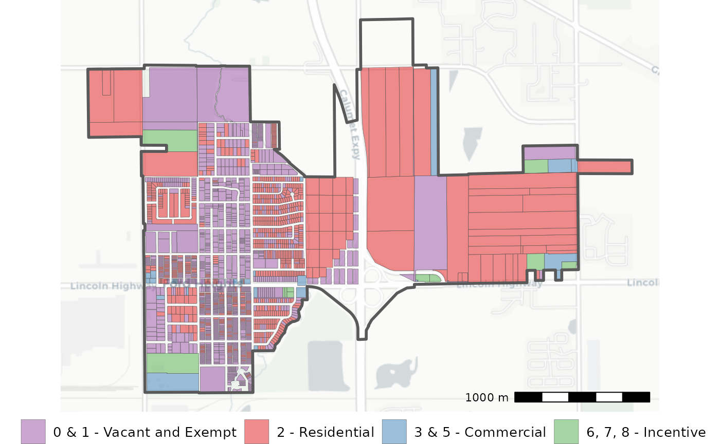
The map of Ford Heights reveals an interesting pattern that would have been difficult to see otherwise. Mainly, that the west part of the village is mainly vacant and exempt land, interspersed with residential property, while the east side is larger tracts of mainly vacant residential parcels.
Single non-taxing area
Sometimes you may need to create a map of a non-taxing area like a ward, judicial district, or other political boundary. This can be tricky since such areas do not have a corresponding tax agency number, so we can’t easily find which PINs are within them. In such cases, we’ll need to resort to performing a spatial query to find all the PINs within the area’s boundary.
Gathering PINs of interest
To demonstrate such a case, we can use Chicago Ward 48. The first thing we need to do is find a boundary of Ward 48. Fortunately, the ward boundaries are available on the Chicago Data Portal.
ward_bound <- st_read(
  "https://data.cityofchicago.org/resource/k9yb-bpqx.geojson"
) %>%
  filter(ward == "48")
Next, we’ll need to retrieve parcel centroids to intersect with the
ward boundary. These are available via the pin_geometry
view. We can query them directly for only Chicago and then convert them
to point geometries using sf.
# All Chicago tax codes start with 7. So this is a quick way to get all
# Chicago PINs and their centroids
chi_pins <- DBI::dbGetQuery(
  ptaxsim_db_conn, "
  SELECT p.year, p.pin, p.class, pg.longitude, pg.latitude
  FROM pin p
  INNER JOIN pin_geometry pg
      ON substr(p.pin, 1, 10) = pg.pin10
      AND p.year = pg.year
  WHERE substr(p.tax_code_num, 1, 1) = '7'
  AND p.year = 2021
  "
)

# Manually convert lat/lon to point
chi_pins <- chi_pins %>%
  st_as_sf(coords = c("longitude", "latitude"), crs = 4326)
Finally, we perform a spatial intersection to determine which of the Chicago PINs lie within the Ward 48 boundary.
ward_pins <- chi_pins %>%
  filter(as.logical(st_within(., ward_bound)))

glimpse(ward_pins)
#> Rows: 17,443
#> Columns: 4
#> $ year     <int> 2021, 2021, 2021, 2021, 2021, 2021, 2021, 2021, 2021, 2021, 2…
#> $ pin      <chr> "14051000010000", "14051000020000", "14051000030000", "140510…
#> $ class    <chr> "517", "590", "212", "212", "212", "212", "212", "517", "517"…
#> $ geometry <POINT [°]> POINT (-87.67019 41.99786), POINT (-87.67015 41.9977), …
So, in tax year 2021, Ward 48 has about 17,000 individual PINs.
Mapping the area
Now we can use the list of PINs to retrieve the individual PIN boundaries in the same way we did for the taxing district. Here is the code from before but in a single step:
ward_pins_geo <- lookup_pin10_geometry(
  year = 2021,
  pin10 = unique(substr(ward_pins$pin, 1, 10))
) %>%
  st_as_sf(wkt = "geometry", crs = 4326)
Finally, we can do the same aggregatiion and plotting we did for the Ford Heights map.
Click here to show plot code
ward_pins_geo <- ward_pins_geo %>%
  left_join(
    ward_pins %>%
      st_drop_geometry() %>%
      mutate(pin10 = substr(pin, 1, 10)) %>%
      group_by(pin10) %>%
      summarize(class = first(class)),
    by = "pin10"
  ) %>%
  mutate(
    major_class = substr(class, 1, 1),
    major_class_fct = recode_factor(
      major_class,
      "0" = "0 & 1 - Vacant and Exempt",
      "1" = "0 & 1 - Vacant and Exempt",
      "2" = "2 - Residential",
      "3" = "3 & 5 - Commercial",
      "5" = "3 & 5 - Commercial",
      "4" = "Other",
      "9" = "Other"
    )
  )

ward_pins_map <- ggplot() +
  annotation_map_tile(type = "cartolight", zoomin = -1) +
  geom_sf(
    data = ward_pins_geo,
    aes(fill = major_class_fct),
    alpha = 0.5,
    linewidth = 0.1
  ) +
  geom_sf(data = ward_bound, fill = "transparent", linewidth = 1) +
  annotation_scale(location = "br") +
  scale_fill_manual(
    name = "",
    values = c(
      "0 & 1 - Vacant and Exempt" = "#984ea3",
      "2 - Residential" = "#e41a1c",
      "3 & 5 - Commercial" = "#377eb8",
      "Other" = "#4daf4a"
    )
  ) +
  guides(color = guide_legend(override.aes = list(size = 5))) +
  theme_void() +
  theme(
    legend.title = element_text(size = 14),
    legend.text = element_text(size = 10),
    legend.key.size = unit(18, "points")
  )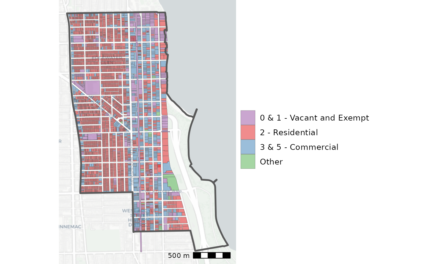
Here we can again see an interesting spatial pattern: most of Ward 48’s commercial properties are clustered around the CTA tracks. Additionally, commercial properties rapidly disappear west of Broadway.
Making multi-area maps
Now that we’ve seen how to map the single-area case, let’s expand to the multiple area case. Such maps are useful for visualizing the extent and overlap of different districts. Let’s stay in Ford Heights, but this time we’ll plot all of the agencies in Ford Heights, not just the municipality.
# We again need to find tax codes, this time for all Ford Height agencies
fhm_tax_codes <- DBI::dbGetQuery(
  ptaxsim_db_conn,
  glue_sql("
    SELECT tax_code_num, agency_num
    FROM tax_code
    WHERE agency_num IN ({fh_agency_nums$agency_num*})
    AND year = 2021
    ",
    .con = ptaxsim_db_conn
  )
)

# And we use the tax codes to find all PINs in those agencies
fhm_pins <- DBI::dbGetQuery(
  ptaxsim_db_conn,
  glue_sql("
    SELECT pin, class, tax_code_num
    FROM pin
    WHERE tax_code_num IN ({fhm_tax_codes$tax_code_num*})
    AND year = 2021
    ",
    .con = ptaxsim_db_conn
  )
)
This gives us about 2,300 PINs, roughly 300 more than the Village of Ford Heights has alone. We can fetch and prepare the geometries the same way we did for the single district case.
fhm_pins_geo <- lookup_pin10_geometry(
  year = 2021,
  pin10 = unique(substr(fhm_pins$pin, 1, 10))
) %>%
  st_as_sf(wkt = "geometry", crs = 4326)
Finally, we’ll map the PINs. This time however, we’ll color the PIN boundaries by agency name rather than property class. This will give us a good look at how the various Ford Heights agencies overlap.
Click here to show plot code
fhm_pins_geo <- fhm_pins_geo %>%
  left_join(
    fhm_pins %>%
      mutate(pin10 = substr(pin, 1, 10)) %>%
      group_by(pin10) %>%
      summarize(tax_code_num = first(tax_code_num)),
    by = "pin10"
  ) %>%
  left_join(fhm_tax_codes, by = "tax_code_num") %>%
  left_join(fh_agency_nums, by = "agency_num") %>%
  # Filter ugly railroad PINs
  filter(!pin10 %in% c("3222501001", "3227500001", "3227501004")) %>%
  mutate(
    an = recode_factor(
      agency_name,
      "FORD HEIGHTS PUBLIC LIBRARY DISTRICT" = "FH LIBRARY",
      "FORD HEIGHTS PARK DISTRICT" = "FH PARK + VILLAGE",
      "VILLAGE OF FORD HEIGHTS" = "FH PARK + VILLAGE",
      "TIF - FORD HEIGHTS - COTTAGE GROVE / RTE 20" = "RTE 20 TIF"
    )
  )
#> Warning in sf_column %in% names(g): Detected an unexpected many-to-many relationship between `x` and `y`.
#> ℹ Row 1 of `x` matches multiple rows in `y`.
#> ℹ Row 1 of `y` matches multiple rows in `x`.
#> ℹ If a many-to-many relationship is expected, set `relationship =
#>   "many-to-many"` to silence this warning.

fhm_pins_map <- ggplot() +
  annotation_map_tile(type = "cartolight", zoomin = -1) +
  # Hacky way to get ggplot to respect sf layer position
  geom_sf(
    data = fhm_pins_geo %>% filter(an == "FH LIBRARY"),
    aes(fill = an),
    linewidth = 0.1
  ) +
  geom_sf(
    data = fhm_pins_geo %>% filter(an == "FH PARK + VILLAGE"),
    aes(fill = an),
    linewidth = 0.1
  ) +
  geom_sf(
    data = fhm_pins_geo %>% filter(an == "RTE 20 TIF"),
    aes(fill = an),
    linewidth = 0.1
  ) +
  annotation_scale(location = "br") +
  scale_fill_manual(
    name = "",
    values = c(
      "FH LIBRARY" = "#f6a8a3",
      "FH PARK + VILLAGE" = "#4eae7b",
      "RTE 20 TIF" = "#7f87ba"
    )
  ) +
  guides(color = guide_legend(override.aes = list(size = 5))) +
  theme_void() +
  theme(
    legend.title = element_blank(),
    legend.text = element_text(size = 10),
    legend.key.size = unit(18, "points"),
    legend.position = "bottom"
  )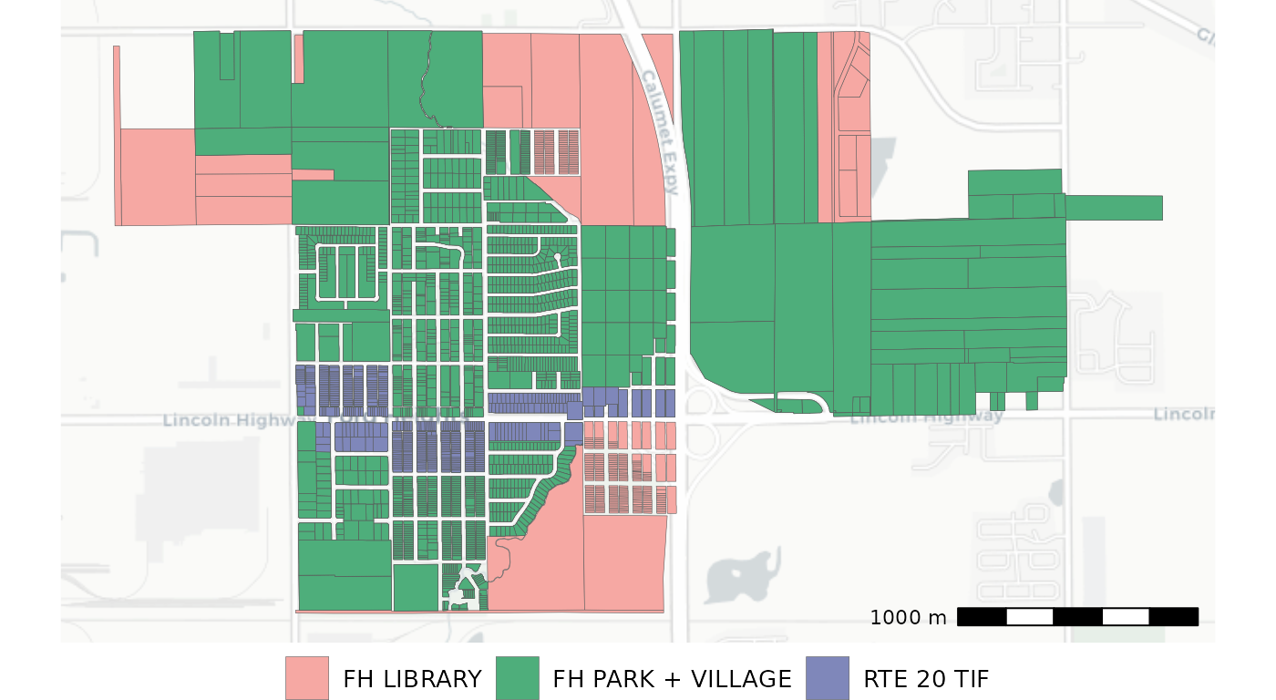
Here we can see four taxing districts: a library, a park district, the municipality, and a TIF. The park district and municipality overlap perfectly (and so are combined), but the library district is slightly larger. Meanwhile, the TIF district covers only a small commercial strip along Route 20.
Mapping tax bill changes
One common mapping task using Cook County parcels is showing tax bill changes over time. This can be done using solely data contained in the PTAXSIM database.
As an example, we can find all the bill changes for PINs in Chicago’s
Ward 48. PTAXSIM’s pin table contains the final bill
amounts for each year, so we can simply query that table directly given
a start year, end year, and the ward PINs (which we found
previously).
# Get all bill amounts from 2006 and 2021
chg_bills <- DBI::dbGetQuery(
  ptaxsim_db_conn, glue_sql("
    SELECT year, pin, class, tax_bill_total
    FROM pin
    WHERE year IN (2006, 2021)
    AND pin IN ({ward_pins$pin*})
  ",
    .con = ptaxsim_db_conn
  )
)
Next, we can calculate the percent change from 2006 to 2021 for each PIN. We’ll also collapse to the PIN10 level by taking the average of the changes within each PIN10.
chg_bills_summ <- chg_bills %>%
  pivot_wider(
    id_cols = pin,
    names_from = year,
    values_from = tax_bill_total
  ) %>%
  mutate(pct_change = (`2021` - `2006`) / `2006`) %>%
  mutate(pin10 = substr(pin, 1, 10)) %>%
  group_by(pin10) %>%
  summarise(
    avg_bill_change = mean(pct_change, na.rm = TRUE),
    avg_bill_change = ifelse(is.nan(avg_bill_change), 0, avg_bill_change),
    # Bucket the continuous % change amount into bins for easier visualization
    bill_chg_fct = cut(
      x = avg_bill_change,
      breaks = c(-Inf, 0, 0.25, 0.5, 0.75, 1, 1.25, 1.5, Inf),
      labels = c(
        "Decreased", "0-25%", "25-50%", "50-75%", "75-100%",
        "100-125%", "125-150%", "150%+"
      ),
      include.lowest = TRUE
    )
  )
Finally, we can plot each PIN’s percent change in bill.
Click here to show plot code
chg_bills_geos <- lookup_pin10_geometry(2021, chg_bills_summ$pin10) %>%
  st_as_sf(wkt = "geometry", crs = 4326) %>%
  left_join(chg_bills_summ, by = "pin10")

chg_bills_map <- ggplot() +
  annotation_map_tile(type = "cartolight", zoomin = -1) +
  geom_sf(
    data = chg_bills_geos,
    aes(fill = bill_chg_fct),
    alpha = 0.8,
    linewidth = 0
  ) +
  geom_sf(data = ward_bound, fill = "transparent", linewidth = 1) +
  annotation_scale(location = "br") +
  scale_fill_manual(
    name = "Average Tax Bill\nChange, 2006 to 2021",
    values = c("#E65E5E", RColorBrewer::brewer.pal(7, "BuPu"))
  ) +
  guides(color = guide_legend(override.aes = list(size = 4))) +
  theme_void() +
  theme(
    legend.title = element_text(size = 12),
    legend.text = element_text(size = 10),
    legend.key.size = unit(24, "points")
  )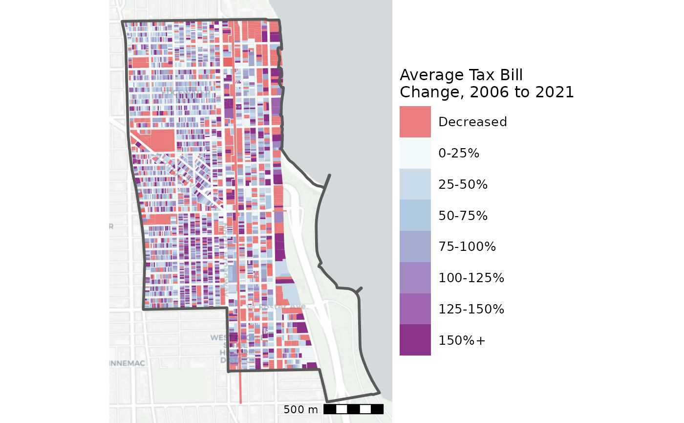
The spatial pattern here is intuitive to someone familiar with the area. The darker purple PINs in the southwestern corner of the ward are part of Andersonville, a quickly-growing neighborhood. Conversely, the lighter blue (and red) colored PINs east of the CTA tracks are Edgewater, which has had slower growth and some vacancy issues.
