AssessR’s primary use is to conduct sales ratio studies. In this vignette, we demonstrate that process using real data from the Cook County Assessor’s Office (CCAO). The CCAO publishes assessments and sales on the Cook County Open Data Portal.
Basics of sales ratio studies
A sales ratio is the ratio of the assessor’s estimate of a property’s value to the sale price of a property. A sales ratio study is a report on how accurately and fairly an assessor predicted property values. The CCAO has a rigorous set of rules that govern how sales ratios studies are conducted.
In general, there are four important statistics produced in sales ratio studies, listed in bold in the table below. It is important to understand that these statistics are calculated based on properties that sell. In most jurisdictions, the number of properties that sell in any single year is a very small percentage of the overall number of properties. In order to characterize the quality of the assessment role in a jurisdiction, we draw an inference from this small number of properties.
| Statistic | Acceptable Range | Interpretation |
|---|---|---|
| COD | 5 - 15 | How often properties with the same sale price receive the same predicted market value. Lower CODs indicate more fairness between similarly priced properties. |
| PRD | .98 - 1.03 | How often properties with different sale prices receive the proportionately different predicted market values. Lower PRDs indicate more fairness between low and high-priced properties. |
| PRB | -.05 - .05 | PRB is a different approach to measuring fairness across homes with different sale prices. |
| Median Ratio | .9 - 1.1 | The median ratio measures whether the most common ratios accurately reflect sale prices. |
| MKI | .95 - 1.05 | Measures the difference in inequality between assessed valuations and sale prices. |
| Sales Chasing (E.4) | 5% | Measures the degree to which the statistics above are true reflections of the quality of assessments. |
Interpretation of sales ratio statistics
Suppose you have a jurisdiction with a median ratio of 1 and a COD of 20. This indicates that, on average, the assessor predicts the sale price of properties accurately, but with a high dispersion. To use the dart board analogy, the assessor’s darts fall in a wide area centered around the bullseye. On the other hand, if the median ratio is greater than one, and the COD is lower than 10, this indicates that the assessor consistently over-estimates the value of properties in their jurisdiction.
Suppose you have a jurisdiction with a low COD and high PRD/PRB. This indicates that the assessor consistently under-estimates higher value properties, and over-estimates lower value properties. Properties of similar value receive similar estimates, but there is structural inequality in the overall system.
Finally, suppose you have a jurisdiction with CODs, PRDs, and PRBs all within the acceptable range, but there is strong evidence of selective appraisals. In this case, the sales value statistics should be disregarded, since they are based on a non-random selection of the underlying set of properties. They cannot be used to characterize the quality of the assessment role.
Loading data into R
There are many ways to load data into R. Below are some example methods:
RSocrata
RSocrata is a package developed by the City of Chicago to wrap Socrata API requests. It allows you to easily pass a Socrata app token, which will remove the API limit on the number of rows returned. Example usage is shown below. Replace the login details with your own.
library(RSocrata)

# Load unlimited rows of assessment data, default is 1,000
assessments <- read.socrata(
  "https://datacatalog.cookcountyil.gov/resource/uzyt-m557.json",
  app_token = "YOURAPPTOKENHERE",
  email     = "user@example.com",
  password  = "fakepassword"
)
jsonlite
Socrata can also return raw JSON if you manually construct a query
URL. Follow the API
docs to alter your query. The raw JSON output can be read using the
read_json() function from jsonlite.
library(dplyr)
library(jsonlite)
library(stringr)

# Load 100k rows of 2022 residential (major class 2) assessment data
assessments <- read_json(
  paste0(
    "https://datacatalog.cookcountyil.gov/resource/uzyt-m557.json?",
    "$where=starts_with(class,'2')&tax_year=2022&$limit=100000"
  ),
  simplifyVector = TRUE
) %>%
  # read_json removes leading zeroes, add them back
  mutate(pin = str_pad(pin, 14, "left", "0"))

# Load 100k rows of 2022 sales data
sales <- read_json(
  URLencode(paste0(
    "https://datacatalog.cookcountyil.gov/resource/wvhk-k5uv.json?",
    "year=2022 and sale_price>=10000&$limit=100000"
  )),
  simplifyVector = TRUE
) %>%
  # read_json removes leading zeroes, add them back
  mutate(
    pin = str_pad(pin, 14, "left", "0"),
    year = as.character(as.integer(year))
  )
CSV or Excel
R can also read Excel and CSV files stored on your computer.
library(readxl)

# CSV files
assessments <- read.csv(
  file = "C:/Users/MEEE/Documents/.... where is your file ?"
)
sales <- read.csv(
  file = "C:/Users/MEEE/Documents/.... where is your file ?"
)

# Excel files
assessments <- read.csv(
  file = "C:/Users/MEEE/Documents/.... where is your file ?"
)
sales <- readxl::read_excel(
  file = "C:/Users/MEEE/Documents/.... where is your file ?",
  sheet = "your sheet"
)
Relational databases
The CCAO’s Data Department uses Amazon Athena, but R can connect to a wide range of database engines.
library(noctua)
library(DBI)

# Connect to the database using a configured .Renviron file.
AWS_ATHENA_CONN_NOCTUA <- dbConnect(noctua::athena())

# Fetch data from Athena
assessments <- dbGetQuery(
  AWS_ATHENA_CONN_NOCTUA,
  "SELECT * FROM [MY DATA TABLES]"
)

# Disconnect DB connection
dbDisconnect(AWS_ATHENA_CONN_NOCTUA)
Sales ratio study
In this section, we will use data published on the Cook County Open Data Portal to produce an example sales ratio study.
Prepare the data
Above, we pulled assessment and sales data from the Open Data Portal. In order to produce our sales ratio statistics, our data needs to be formatted in ‘long form,’ meaning that each row is a property in a given year. The county provides assessed value on the Open Data Portal. For residential properties, we need to multiply assessed value by 10 to get fair market value. Assessment levels can differ for other classes.
library(assessr)
library(dplyr)
library(tidyr)
library(knitr)

# Join the two datasets based on PIN, keeping only those that have assessed
# values AND sales
combined <- inner_join(
  assessments %>%
    select(pin, year, township_name, mailed_tot, certified_tot, board_tot),
  sales %>%
    select(pin, year, sale_price, is_multisale),
  by = c("pin", "year" = "year")
) %>%
  filter(township_name %in% c("New Trier", "Palatine"))

# Remove multisales, pivot to longer, then calculate the ratio for each property
# and assessment stage
combined <- combined %>%
  filter(!is_multisale) %>%
  pivot_longer(
    mailed_tot:board_tot,
    names_to = "stage",
    values_to = "assessed"
  ) %>%
  mutate_at(vars(sale_price, assessed), as.numeric) %>%
  mutate(ratio = (assessed * 10) / sale_price)
Sales ratio statistics by township
Cook County has jurisdictions called townships that are important units for assessment. In the chunk below, we calculate sales ratio statistics for two townships.
# For each town and stage, calculate COD, PRD, and PRB, and their respective
# confidence intervals then arrange by town name and stage of assessment
combined %>%
  filter(assessed > 0) %>%
  group_by(township_name, stage) %>%
  summarise(
    n = n(),
    cod = cod(ratio, na.rm = TRUE),
    cod_ci = paste(
      round(cod_ci(ratio, nboot = 1000, na.rm = TRUE), 3),
      collapse = ", "
    ),
    cod_met = cod_met(cod),
    prb = prb(assessed, sale_price, na.rm = TRUE),
    prb_ci = paste(
      round(prb_ci(assessed, sale_price, na.rm = TRUE), 3),
      collapse = ", "
    ),
    prb_met = prb_met(prb)
  ) %>%
  filter(n >= 70) %>%
  mutate(stage = factor(
    stage,
    levels = c("mailed_tot", "certified_tot", "board_tot")
  )) %>%
  arrange(township_name, stage) %>%
  rename_all(toupper) %>%
kable(format = "markdown", digits = 3)| TOWNSHIP_NAME | STAGE | N | COD | COD_CI | COD_MET | PRB | PRB_CI | PRB_MET |
|---|---|---|---|---|---|---|---|---|
| New Trier | mailed_tot | 84 | 24.965 | 14.014, 44.969 | FALSE | -0.160 | -0.336, 0.016 | FALSE |
| New Trier | certified_tot | 84 | 24.431 | 13.397, 40.818 | FALSE | -0.160 | -0.336, 0.017 | FALSE |
| New Trier | board_tot | 84 | 23.375 | 12.89, 41.536 | FALSE | -0.178 | -0.355, 0 | FALSE |
| Palatine | mailed_tot | 927 | 13.968 | 11.909, 16.64 | TRUE | -0.026 | -0.058, 0.006 | TRUE |
| Palatine | certified_tot | 927 | 14.004 | 11.921, 16.581 | TRUE | -0.024 | -0.056, 0.008 | TRUE |
| Palatine | board_tot | 927 | 13.900 | 11.746, 16.541 | TRUE | -0.029 | -0.061, 0.003 | TRUE |
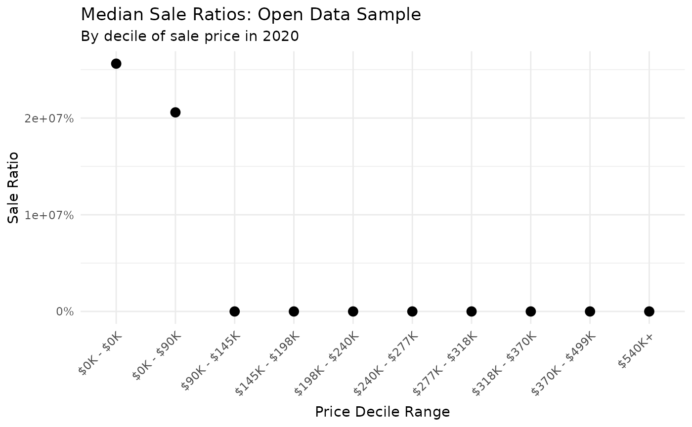
Median ratios by sale price
Suppose you are concerned that an assessment role is unfair to lower
value homes. One way to visually see whether ratios are systematically
biased with respect to property value is to plot median ratios by
decile. In our sample data, we can see each decile of sale price using
the quantile function:
library(DT)

data.frame(quantile(combined$sale_price, probs = 1:9 / 10)) %>%
  setNames("Sale Price") %>%
  tibble::rownames_to_column(var = "Decile") %>%
  DT::datatable(
    class = "cell-border stripe",
    rownames = FALSE,
    options = list(dom = "t")
  ) %>%
  formatCurrency("Sale Price", digits = 0)
Using these decile values, we can graph sales ratios across each
decile of value. Here, we use the very useful ggplot2
package to make an attractive graph.
library(ggplot2)
library(scales)

# Prepare the data by getting the minimum and maximum sale price of each decile
graph_data <- combined %>%
  mutate(decile = ntile(sale_price, 10)) %>%
  group_by(decile) %>%
  mutate(decile_label = paste(
    dollar(min(sale_price) / 1000, accuracy = 1, suffix = "K"),
    dollar(max(sale_price) / 1000, accuracy = 1, suffix = "K"),
    sep = " - "
  )) %>%
  mutate(decile_label = ifelse(decile == 10, "$540K+", decile_label)) %>%
  mutate(decile_label = forcats::fct_reorder(decile_label, decile)) %>%
  group_by(decile_label) %>%
  summarise(
    n = n(),
    `Median Sales Ratio` = median(ratio)
  ) %>%
  dplyr::filter(n > 70)

# Create a plot of sales ratio by decile
ggplot(graph_data) +
  geom_point(aes(x = decile_label, y = `Median Sales Ratio`), size = 3) +
  scale_y_continuous(labels = function(x) paste0(x * 100, "%")) +
  labs(
    title = "Median Sale Ratios: Open Data Sample",
    subtitle = "By decile of sale price in 2022",
    x = "Price Decile Range",
    y = "Sale Ratio"
  ) +
  theme_minimal() +
  theme(
    axis.text.x = element_text(angle = 45, vjust = 1, hjust = 1),
    axis.title.x = element_text(margin = margin(t = 6)),
    legend.position = "bottom"
  )
Gini-based measures of vertical equity
Another way to measure the vertical equity of assessments is to look at differences in Gini coefficients, a widely used metric to analyze inequality.
The first step in this process is to order the data (ascending) by sale price. Next, calculate the Gini coefficient of sales and assessed values (both ordered by sale price). The difference between these Gini coefficients is known as the Kakwani Index (KI), while the ratio is known as the Modified Kakwani Index (MKI). See this paper for more information on these metrics.
Lorenz curves
Using the ordered data, you can plot the classic Lorenz curve:
gini_data <- combined %>%
  select(sale_price, assessed) %>%
  arrange(sale_price)

sale_price <- gini_data$sale_price
assessed <- gini_data$assessed

lorenz_data_price <- data.frame(
  pct = c(0, cumsum(sale_price) / sum(sale_price)),
  cum_pct = c(0, seq_along(sale_price)) / length(sale_price)
)

lorenz_data_assessed <- data.frame(
  pct = c(0, cumsum(assessed) / sum(assessed)),
  cum_pct = c(0, seq_along(assessed)) / length(assessed)
)

ggplot() +
  geom_line(
    data = lorenz_data_price,
    aes(x = cum_pct, y = pct), color = "blue"
  ) +
  geom_line(
    data = lorenz_data_assessed,
    aes(x = cum_pct, y = pct), color = "red"
  ) +
  geom_abline(intercept = 0, slope = 1, linetype = "dashed", color = "green") +
  geom_text(
    data = data.frame(x = 0.8, y = 0.48, label = "Sale Price"),
    aes(x, y, label = label), color = "blue", vjust = 1
  ) +
  geom_text(
    data = data.frame(x = 0.5, y = 0.45, label = "Assessed Value"),
    aes(x, y, label = label), color = "red", vjust = 1
  ) +
  scale_x_continuous(labels = scales::label_percent()) +
  scale_y_continuous(labels = scales::label_percent()) +
  labs(
    title = "Lorenz Curve for Sales and Assessed Values",
    x = "Percent of Properties",
    y = "Percent of Value"
  ) +
  theme_minimal()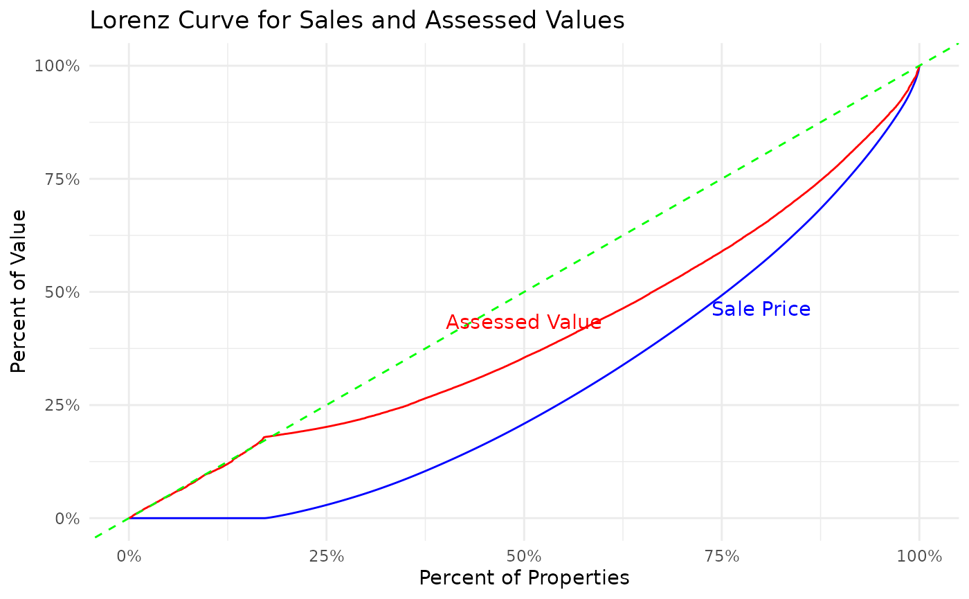
In this graphic, the green line (Line of Equality) represents a hypothetical environment, where property valuations are completely equitable. The axes represent the cumulative percentage of value (y-axis) as the percentage of properties (x-axis) increases.
The curves show that for the vast majority of the income distribution, assessed values are closer to the Line of Equality. This can be interpreted two ways:
- When the assessed value curve is above the sale price curve, the gap between the the two lines at any individual point, represents the cumulative over-assessment for all houses at that value or below.
- Gini coefficient for sale price is going to be higher than the Gini coefficient for assessed price (larger area between the the curve and the Line of Equality).
In this situation, the graph shows slightly regressive property valuations. This is not immediately intuitive, but to conceptualize this, think of an exaggerated “progressive” policy, where all houses were valued at $0 with one house responsible for all the assessed value. In this distribution, curve would be at 0 until the final house, where it would jump to 100% of the cumulative value (a Gini of 1). Thus, a higher Gini represents more progressive assessments, where tax assessments become larger as property value increases.
KI and MKI
To translate these curves to a single metric, the Kakwani Index (KI) and Modified Kakwani Index (MKI) are used (as proposed by Quintos). These are straightforward, with the following definitions:
-
Kakwani Index:
Assessed Gini - Sale Price Gini -
Modified Kakwani Index:
Assessed Gini / Sale Price Gini
# Calculate the sum of the n elements of the assessed vector
n <- length(assessed)
g_assessed <- sum(assessed * seq_len(n))

# Compute the Gini coefficient based on the previously calculated sum
# and the increasing sum of all elements in the assessed vector
g_assessed <- 2 * g_assessed / sum(assessed) - (n + 1L)

# Normalize the Gini coefficient by dividing it by n.
gini_assessed <- g_assessed / n

# Follow the same process for the sale_price vector
g_sale <- sum(sale_price * seq_len(n))
g_sale <- 2 * g_sale / sum(sale_price) - (n + 1L)
gini_sale <- g_sale / n

MKI <- round(gini_assessed / gini_sale, 4)
KI <- round(gini_assessed - gini_sale, 4)
The output for the Modified Kakwani Index is 0.9415, and the Kakwani Index is -0.0252. According to the following table, this means that the assessments are slightly regressive.
| KI Range | MKI Range | Interpretation |
|---|---|---|
| < 0 | < 1 | Regressive |
| = 0 | = 1 | Vertical Equity |
| > 0 | > 1 | Progressive |
Detecting selective appraisals
Selective appraisal, sometimes referred to as sales chasing, happens when a property is reappraised to shift its assessed value toward its actual sale price. The CCAO requires selective appraisal detection in every sales ratio study. This is because selective appraisal renders all other sales ratio statistics suspect. In the code below, we construct two sets of ratios, one normally distributed, and one ‘chased.’
# Generate distributions of fake ratios, including one with "sales chasing"
normal_ratios <- c(rnorm(1000, 1, 0.15))
chased_ratios <- c(rnorm(900, 1, 0.15), rep(1, 100))

# Plot the CDFs of each vector. Notice the flat spot on the red CDF
ggplot() +
  stat_ecdf(data = data.frame(x = normal_ratios), aes(x), color = "blue") +
  stat_ecdf(data = data.frame(x = chased_ratios), aes(x), color = "red") +
  geom_vline(xintercept = 0.98) +
  geom_vline(xintercept = 1.02) +
  xlim(0.7, 1.3) +
  labs(x = "Ratio", y = "F(x)") +
  theme_minimal()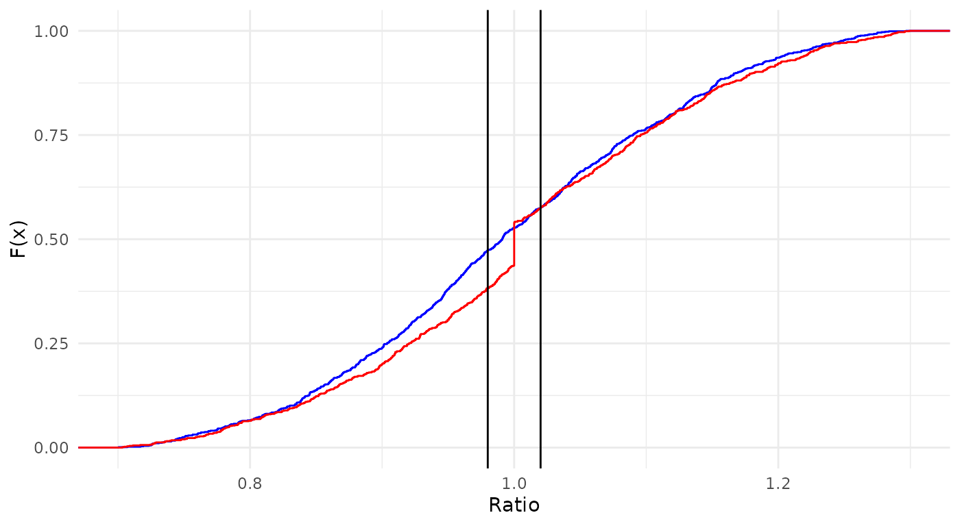
# Detect chasing for each vector
tibble(
  "Blue Chased?" = detect_chasing(normal_ratios),
  "Red Chased?" = detect_chasing(chased_ratios)
) %>%
kable(format = "markdown", digits = 3)| Blue Chased? | Red Chased? |
|---|---|
| FALSE | TRUE |
Ratios that include selective appraisals will be clustered around the value of 1 much more than ratios produced by a CAMA system. We can see this visually in the graph where the cumulative distribution curve shows a discontinuous jump, or ‘flat spot’, near 1.